


Considering 94% of a website’s first impressions are related to design, we curated a list of the best designed websites in 2021.
Via THE OFFICIAL ANDREASCY
Get Started for FREE
Sign up with Facebook Sign up with X
I don't have a Facebook or a X account


 Your new post is loading...
 Your new post is loading...
Your new post is loading...
 Scoop.it!
Considering 94% of a website’s first impressions are related to design, we curated a list of the best designed websites in 2021. Via THE OFFICIAL ANDREASCY 

sofia carlos's curator insight,
April 16, 2022 7:59 PM
https://www.bostonterrierpetshome.com https://www.bostonterrierpetshome.com https://www.bostonterrierpetshome.com https://www.bostonterrierpetshome.com https://www.bostonterrierpetshome.com https://www.bostonterrierpetshome.com

museumofjewelry's comment,
September 13, 2023 2:06 AM
good
Sign up to comment
Scoop.it!
![6 Best Practices of Responsive Web Design [Infographic] | Business Improvement and Social media | Scoop.it](https://img.scoop.it/GEiP8AlElwKVA2cIR8IpFDl72eJkfbmt4t8yenImKBVvK0kTmF0xjctABnaLJIm9)
Responsive design for a website is often used in the context of mobile users. Given the fact that more and more users are using mobile devices such as their smartphones and tablets to access the web, both for browsing and otherwise, it is extremely important that website designs become responsive towards all devices and screen sizes.
Find more advantages, benefits and best practices of responsive design at the infographic and article link. Via Lauren Moss

Massimo Petrucci's curator insight,
April 22, 2014 4:27 AM
Interessante infografica che mostra le dimensioni ideali degli oggetti web e delle immagini quando si progetta un template resposive. 
Mr Tozzo's curator insight,
April 23, 2014 5:42 AM
6 Best Practices of Responsive Web Design [Infographic]

Pallab Kakoti's curator insight,
April 24, 2014 4:56 AM
Responsive designs are the window into the future of web portability to drive higher per user engagement by embedding the concept of Probability Scores. An aggregate of Content Scores & Engagement Scores are debated prior to finalizing which sections gets a higher Probability Score that will eventually determine content position in the responsive design layout. Probability Scores aims at achieving better per user click through rate owing to its full width auto adaptive content display interface that adjust the landing page content based on the device.
Earlier websites used to feed different URLs for different devices. For example m.sitename.com or mobile.sitename.com indicated that the URL is for mobile or smart devices. But now things have changed thanks for responsive design attributes that determines the device that is trying to access the site URL before optimizing the content layout to adjust automatically with the device interface. This way the same URL is serving any device that is trying to access the website which again is compliance for search engine algorithm.
Responsive design has the advantage to every inch of the device or browser interface to maximize the user’s engagement intent possibility. Compelling visual storytelling theme powered by catchy headlines or titles richly feed with an interesting content copy furthermore elevates user interest to engage. This nature in elevating intent & urge to get involved have statistically indicated the favourability of lead generation & conversion rates from responsive designs.
Mobile devices will overtake PC user worldwide citing encouraging statistics to enthuse responsive design for websites, emails & landing pages. Responsive design layouts devised with #ProbabilityScores are based on the overall marketing objectives & branding goals. An implosive content marketing strategy with a creative team of visual storytellers delivers inspiring results and therefore the greater goodness is in the adoption of Responsive Site Design.
#ProbabilityScores <> #ContentScores <> #ContentEngagement Visit the blogs4bytes Responsive Content Design HomepageCheck out the Responsive Content Scores for the blogs4bytes Homepage
http://sonicrituals.brinkster.net/ps/probabilityscores.png
Responsive Design, Parallax Campaigns, Hashtag Marketing, SEO & SMO all blend into one to serve a hot cup of result driven digital marketing performance with #blogs4bytes // Follow the conversation.
Scoop.it!
![10 Tips To Build A Responsive Website [Infographic] | Business Improvement and Social media | Scoop.it](https://img.scoop.it/eRraDMqmkZcM4QW_DTYFZDl72eJkfbmt4t8yenImKBVvK0kTmF0xjctABnaLJIm9)
Want your website to look great on smartphones, tablets, PCs and even TVs? Learn how to go fully responsive. The Web and the mobile browsers remain one of the top ways that users interact with websites and if they have trouble on their smartphone, there is a good chance they are not coming back. That’s where responsive design can help. Responsive design is a concept where you build your website once and then format it so it can adapt to any screen size that accesses it. Designers use HTML5 and CSS to build the sites and set parameters so the content will resize itself whether the user is in vertical or horizontal viewing mode, on a tablet, desktop or smartphone or even a screen as large as a television... Via Lauren Moss, Brian Yanish - MarketingHits.com, John van den Brink

bancoideas's curator insight,
April 17, 2013 7:58 AM
Mira esta #infografía con 10 tips para construir tu sitio #web #responsive, #ideas útiles 
Filipe MS Bento's curator insight,
April 18, 2013 10:30 AM
Excelent infografic (as graphic as you can get!):
Scoop.it!
![Why a Mobile Website Is Part of Any Business Plan [INFOGRAPHIC] | Business Improvement and Social media | Scoop.it](https://img.scoop.it/sUnak3WXcI_F6cS5R6C6vzl72eJkfbmt4t8yenImKBVvK0kTmF0xjctABnaLJIm9)
57% of mobile web users will end up not recommending a website if they had any trouble visiting it on their phones. If a business has a bad website for mobile devices, 34% of visitors will end up going to a competitors’ website. According to WebpageFX, businesses should use CSS for the layout and not tables. They should code with XML or XHTML, and put all the important information on the top of the landing page. ”Mobile website users are usually busy doing something else like waiting in line, walking through town, or spending time out with friends,” reports WebpageFX. “Their main focus is not necessarily your website so information needs to be quick and easy to access.” By 2015, mobile sales in the U.S. are expected to reach $31 billion (right now they’re at $6.7 billion). Businesses have to get ready and have a solid mobile site, since that’s where many sales will start taking place... Via Lauren Moss

Shanika Journey's curator insight,
April 3, 2013 10:13 AM
I can actually say I'm one of the 57% that feels this way. |
Scoop.it!

They are cool, useful and must-have! Do not leave home without these top tech travel gadgets. Via THE OFFICIAL ANDREASCY, Andreas Christodoulou, Mark E. Deschaine, PhD

Stephania Savva, Ph.D's curator insight,
May 26, 2016 7:19 PM
You shouldn't miss this article if you are planning to travel anytime soon! For tech enthusiasts and not only! Really refreshing read!
Scoop.it!
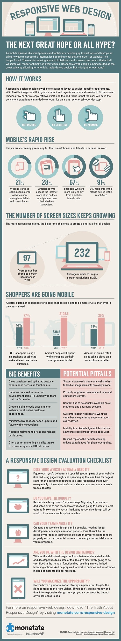
People are increasingly using mobile devices like tablets and smartphones to browse the Web. The variety of screen sizes, resolutions, and platforms people use to access webpages has given birth to the rise of responsive Web design, where developers create one single site to function properly across all devices instead of producing multiple dedicated site designs to work with particular screen sizes and platforms.
While responsive Web design can be a great way for developers to ensure that their site is compatible with all devices, implementing it instead of targeted Web designs also comes with certain drawbacks. Here is an overview of the changing climate of Web devices, followed by tips for evaluating whether or not you should implement a responsive design. Via Lauren Moss

Rim Riahi's curator insight,
August 4, 2013 4:13 AM
Responsive Web Design Infographic: Benefits and Pitfalls

Mark Chapman's curator insight,
August 4, 2013 6:02 PM
Finally some relevant facts and persuasive arguements to show clients. We have been talking about this for almost 3 years and it has been extremely difficult to show clients the benefits and reasons to go mobile but still on a budget
Scoop.it!

Second screen viewing, which refers to using an additional electronic device while watching television, is a widespread consumer behavior that has quickly become the norm. In an attempt to better understand this trend, Viaccess-Orca has analyzed second screen usage amongst diverse populations of television viewers. The results, which appear in this infographic, demonstrate the extent to which second screen viewing is altering the TV industry. According to our data, 70% of tablet owners, and 68% of smartphone owners, state that they use their additional devices while watching TV. However, only 37% of those who practice second screen viewing do so in order to look up information that is related to the program they are watching. Most TV viewers use their devices in order to check emails or visit a social network... Via Lauren Moss
|


