


 Your new post is loading...

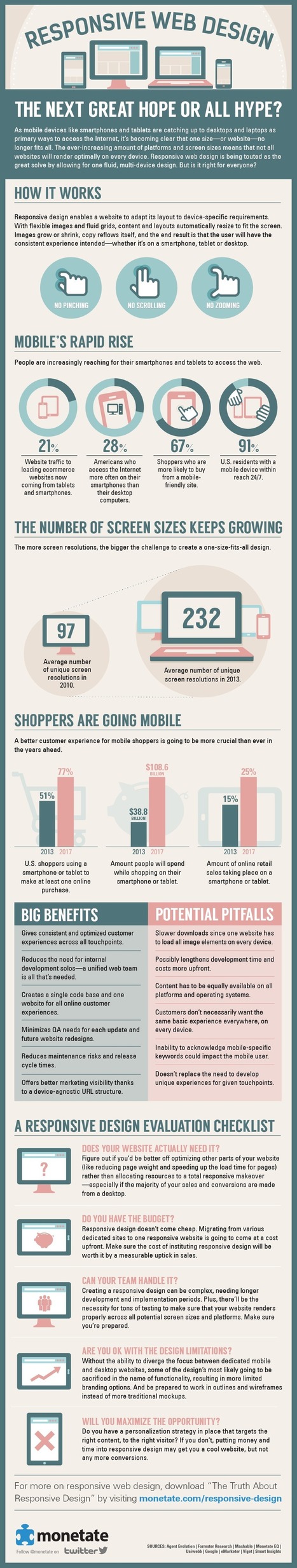

People are increasingly using mobile devices like tablets and smartphones to browse the Web. The variety of screen sizes, resolutions, and platforms people use to access webpages has given birth to the rise of responsive Web design, where developers create one single site to function properly across all devices instead of producing multiple dedicated site designs to work with particular screen sizes and platforms.
While responsive Web design can be a great way for developers to ensure that their site is compatible with all devices, implementing it instead of targeted Web designs also comes with certain drawbacks. Here is an overview of the changing climate of Web devices, followed by tips for evaluating whether or not you should implement a responsive design.
Via Lauren Moss

![Responsive Website Design: Everything You Need To Know [10 Infographics] | Business Improvement and Social media | Scoop.it](https://img.scoop.it/YXtojckc7FpexVMR9nyL5zl72eJkfbmt4t8yenImKBVvK0kTmF0xjctABnaLJIm9)


Finally some relevant facts and persuasive arguements to show clients. We have been talking about this for almost 3 years and it has been extremely difficult to show clients the benefits and reasons to go mobile but still on a budget