

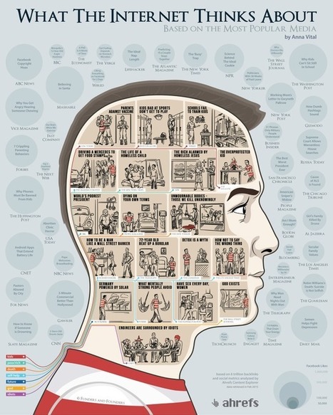
What does the Internet care about? What articles do we share the most? Using the data from the Ahrefs Content Explorer, the people at Funders and Founders
Via Lauren Moss
Get Started for FREE
Sign up with Facebook Sign up with X
I don't have a Facebook or a X account


 Your new post is loading...
 Your new post is loading...
Your new post is loading...
What does the Internet care about? What articles do we share the most? Using the data from the Ahrefs Content Explorer, the people at Funders and Founders Via Lauren Moss 
From
mashable

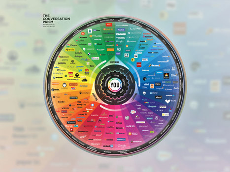
When Brian Solis introduced the first Conversation Prism in 2008, the world was a seemingly simpler place. There were 22 social media categories, each of which had just a handful of brands.
Flash forward to 2013, and the latest Conversation Prism has four additional categories with at least six brands in each. Like other Conversation Prisms, the data visualization attempts to illustrate the array of social media choices available to marketers. While the 2008 chart looked like a flower, the latest one resembles a kaleidoscope. Solis, a prominent social media marketing expert, says redoing the chart this time around has been instructive. "Things are changing so fast," he says. "We don't even realize [the landscape] is shifting."
The chart also points out that, for many, membership in the social media ecosystem is fleeting. While some brands like Xanga, Kyte and Utterz have disappeared, others that weren't around five years ago — like Path and Banjo — are now among category leaders. Via The Digital Rocking Chair, Lauren Moss

Barbara Orlandi's curator insight,
July 4, 2013 10:25 AM
Huge amount of info, sharing, likes, etc... it makes you thinking a lot 
Ryan Burwell's curator insight,
July 8, 2013 1:38 PM
We have so many ways of communicating, Brian Solis had to design a novel way of expressing all the ways we can express ourselves! 
Lee Tonitto's curator insight,
July 19, 2013 9:53 AM
If you need the scoial media landscape in 1 chart here it is |
Increasingly, business leaders are asking: is data visualization actionable? Well, check out the lessons on making data useful from inside The New York Times. Via David Hain
|


Interesting insight into the internet
At least, the concern about equality, energy and social welfare is there. I like the last one about engineers tho. Hahaha.
I think this article is awesome because they use data visualization to show what people share the most, visit the most, and search the most. Data is everywhere and people are using it everyday and sometimes don't even think about it.