

 Your new post is loading...

Research and publish the best content.
Get Started for FREE
Sign up with Facebook Sign up with X
I don't have a Facebook or a X account
Already have an account: Login

E-Learning-Inclusivo (Mashup)
1.1M views |
+15 today


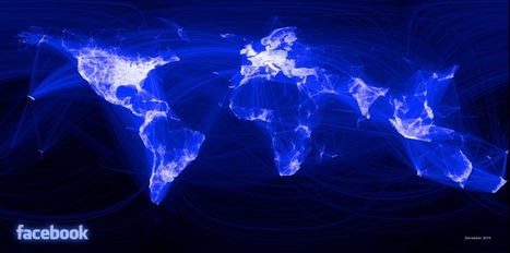
I’ve received a lot comments about the image, many asking for more details on how I created it. When I tell people I used R, the reaction I get is roughly what I would expect if I told them I made it with Microsoft Paintand a bottle of Jägermeister. Some people even questioned whether it was actually done in R. The truth is, aside from the addition of the logo and date text, the image was produced entirely with about 150 lines of R code with no external dependencies. In the process I learned a few things about creating nice-looking graphs in R.
Transparency and Faking It
My first attempt at plotting the data involved plotting very transparent lines. Unfortunately there was just too much data to get a meaningful plot — even at very low opacity, there were enough lines to make the entire image just a bright blob. When I increased the transparency more, the opacity was rounded down to zero by my graphics device and the result was that nothing was drawn.
The solution was to manipulate the drawing order of the lines. I used a simple loop over my data to draw the lines, so it was easy to control which lines are drawn first using order(). I created an ordering based on the length of the lines, so that longer lines were drawn “behind” the shorter, more local lines. Then I used colorRampPalette() to generate a color palette from black to blue to white, and colored the lines according to order they were drawn.