
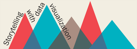

Does your data tell a story and can you visualize it? We look at the history and thought processes behind data visualization and successful infographics.
Via Nik Peachey, Miloš Bajčetić, Yashy Tohsaku, Jim Lerman, elearning hoje
Get Started for FREE
Sign up with Facebook Sign up with X
I don't have a Facebook or a X account


 Your new post is loading...
 Your new post is loading...
Your new post is loading...
Does your data tell a story and can you visualize it? We look at the history and thought processes behind data visualization and successful infographics. Via Nik Peachey, Miloš Bajčetić, Yashy Tohsaku, Jim Lerman, elearning hoje 
'In our Data Visualization 101 series, we cover each chart type to help you sharpen your data visualization skills. Bar charts are a highly versatile way to visually communicate data. Decidedly straightforward, they can convey the message behind the numbers with impact and meaningful clarity, making complex data easy to understand at a glance.' Via Lauren Moss, Jim Lerman, Mark E. Deschaine, PhD

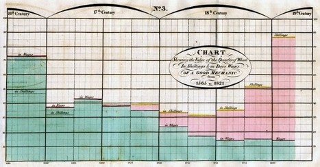
Born in 1888, German scientist, doctor, and author Fritz Kahn was the grandfather of modern data visualization. We’re in the golden age of infographicw, where charts, graphs, and maps transform dense and dry facts into eye candy, and the Internet can’t get enough. But where did this data-viz craze begin? Born in 1888, German scientist, doctor, and author Fritz Kahn was the grandfather of modern data visualization. A new 390-page monograph of Kahn’s work, published by Taschen, takes readers into an illustrated world that features winged fish, insect-size parachutists, and blood cells used as boats. Surreal as these scenes seem, they're actually meant to visualize scientific facts... Via Lauren Moss, Stelios Kessanidis
|
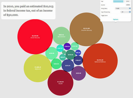
There have never been more technologies available to collect, examine, and render data. Here are 30 different notable pieces of data visualization software good for any designer's repertoire. They're not just powerful; they're easy to use.
In fact, most of these tools feature simple, point-and-click interfaces, and don’t require that you possess any particular coding knowledge or invest in any significant training. Let the software do the hard work for you. Your client will never know.... Via Jeff Domansky

Jeff Domansky's curator insight,
April 25, 2015 2:53 AM
Need a simple tool to create a fantastic data visualization? Here are 30 from Fast Company.
Become storytellers: Modern marketing is less about selling and more about creating brand experiences fueled by brand storytelling. You only have about eight seconds to catch consumers’ attention. To make those seconds count, thoroughly investigate your customers. Some ways to do this: Start with exhaustive persona profiles to build buyer paths from high-level awareness down to purchase so that you’re creating the right types of offers to deliver the appropriate content at every stage of the buying process. Persona research should include: raw data (surveys, internal sales, and analytics data), interviews with sales and support teams, and discussions with or polls sent to existing customers. Add Interest to Email. Despite news of its demise, email is still a marketing workhorse. However, businesses must stop the “spray and pray” method in lieu of incorporating smarter strategies driven by automation to get the most out of the medium. Ways to standout in... keep reading Via Martin (Marty) Smith, malek

malek's curator insight,
July 18, 2014 12:45 PM
With detailed images, you can get the attention of up to 67% of your targeted audiences. And,,,,,,,,you can download a free guide 
massimo scalzo's curator insight,
July 20, 2014 5:07 AM
Martin Smith again on the importance of Visual Content Marketing, Storytelling and Persona ! Really Worth Reading !
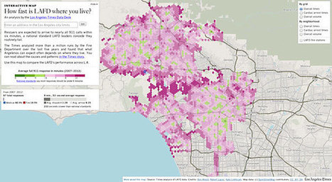
When I wrote that Radar was investigating data journalism and asked for your favorite examples of good work, we heard back from around the world. I received emails from Los Angeles, Philadelphia, Canada and Italy that featured data visualization, explored the role of data in government accountability, and shared how open data can revolutionize environmental reporting...
It was instructive to learn more about the work of two large media organizations, the Los Angeles Times and Canada’s Global News, which have been building their capacity to practice data journalism. The other international perspectives in my inbox and tweet stream, however, were a reminder that big-city newsrooms that can afford teams of programmers and designers aren’t the only players here.acts of data journalism by small teams or individuals aren’t just plausible, they’re happening — from Italy to Brazil to Africa.
That doesn’t mean that the news application teams at NPR, The Guardian, ProPublica or the New York Times aren’t setting the pace for data journalism when it comes to cutting edge work — far from it — but the tools and techniques to make something worthwhile are being democratized. That’s possible in no small part because of the trend toward open source tools and social coding I’m seeing online, from Open Street Map to more open elections... Via Lauren Moss

Lauren Moss's curator insight,
December 22, 2012 7:41 PM
An interesting overall look at the state of data journalism on varying scales, as explored through the examination of case studies, resources and applications. Of particular interest is the role of open data in generating content, and how that may affect the future of data visualization. Still, the numerous online links provided within the article offer a substantial number of references on a broad range of topics that pertain to data journalism and visualization. |


Worth thinking about in terms of how we use data in the classroom.