E-Learning-Inclusivo (Mashup)
1.1M views | +43 today
Follow
E-Learning-Inclusivo (Mashup)
Aprendizaje con TIC basado en los aprendices.
Curated by juandoming
Your new post is loading...
Rescooped by juandoming from #Réseaux,#Data,#Visual data,#Open Data, #Sociabilités, #Savoirs, #Travail, #Utopies, #Social Change,#Innovations, #commons, #Fab Lab, #Crowdsourcing, #Transhumanisme,#Robotisation,#Objets connectés,#E Santé
Scoop.it!

L'arbre de l'évolution à l'heure numérique | #dataviz #openscience

L'arbre de l'évolution à l'heure numérique | #dataviz #openscience | E-Learning-Inclusivo (Mashup) | Scoop.it
Quand Charles Darwin rencontre Larry Page Le premier arbre phylogénétique, tel qu'il apparaît en 1859 dans De l'origine des espèces au moyen de la sélection naturelle de Charles...

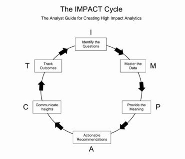
"Dessine-moi un mouton", demandait le Petit Prince à l'aviateur. La représentation graphique a toujours été vecteur de connaissance, mais aujourd'hui, dans une culture qui abandonne peu à peu l'écrit pour l'image, elle devient une composante essentielle de la transmission du savoir. Un second défi se dresse : comment rendre compte de la masse d'informations disponibles pour décrire fidèlement la complexité du monde dans lequel nous évoluons, et notamment la diversité de la biosphère ? La conjugaison de ces deux ambitions a donné naissance au projet OneZoom (www.onezoom.org), un outil numérique qui permet de visualiser une version numérique de l'arbre de la vie. Une immersion dans la biodiversité, et une belle invitation à la curiosité. (...)  - par Guillaume Frasca, La science infuse, 16/10/2012


Source : J. Rosindell et L.J. Harmon, OneZoom: A Fractal Explorer for the Tree of Life, PLoS Biology, 16 octobre 2012.


Via Julien Hering, PhD, luiy, @backbook, Catherine Pascal
No comment yet.
Rescooped by juandoming from e-Xploration
Scoop.it!

The Impact Cycle – how to think of actionable insights | #datascience #methods

The Impact Cycle – how to think of actionable insights | #datascience #methods | E-Learning-Inclusivo (Mashup) | Scoop.it

Via luiy
luiy's curator insight, July 2, 2014 5:10 AM

I. Identify the question. In a non intrusive way, help your business partner identify the critical business question(s) he or she needs help in answering. Then set a clear expectation of the time and the work involved to get an answer.


M. Master the data.This is the analyst’s sweet spot—assemble, analyze, and synthesize all available information that will help in answering the critical business question. Create simple and clear visual presentations (charts, graphs, tables, interactive data environments, and so on) of that data that are easy to comprehend.


P. Provide the meaning. Articulate clear and concise interpretations of the data and visuals in the context of the critical business questions that were identified.


A. Actionable recommendations. Provide thoughtful business recommendations based on your interpretation of the data. Even if they are off-base, it’s easier to react to a suggestion that to generate one. Where possible, tie a rough dollar figure to any revenue improvements or cost savings associated with your recommendations.


C. Communicate insights. Focus on a multi-pronged communication strategy that will get your insights as far and as wide into the organization as possible. Maybe it’s in the form of an interactive tool others can use, a recorded WebEx of your insights, a lunch and learn, or even just a thoughtful executive memo that can be passed around.


T. Track outcomes. Set up a way to track the impact of your insights. Make sure there is future follow-up with your business partners on the outcome of any actions. What was done, what was the impact, and what are the new critical questions that need your help as a result?

Rescooped by juandoming from e-Xploration
Scoop.it!

Visualizing Categorical Data as Flows with Alluvial Diagrams | #dataviz #methods #tools

Visualizing Categorical Data as Flows with Alluvial Diagrams | #dataviz #methods #tools | E-Learning-Inclusivo (Mashup) | Scoop.it

Via luiy
luiy's curator insight, June 7, 2014 12:04 PM

Alluvial diagrams are a type of flow diagram that  have traditionally been used to visually show changes in network structures over time. Density Design has included Alluvial Diagrams in their RAW online visualization tool and explored its use to show “relations between dimensions of categorical data.”


RAW is such a wonderfully easy tool to use that I wanted to explore the Alluvial diagram functionality with a few different data sets to see how the visualizations would come out.


Rescooped by juandoming from e-Xploration
Scoop.it!

Introduction to Circos, Features and Uses | #dataviz #datascience

Introduction to Circos, Features and Uses | #dataviz #datascience | E-Learning-Inclusivo (Mashup) | Scoop.it

Via luiy
luiy's curator insight, February 28, 2014 6:26 AM

Circos is a software package for visualizing data and information. It visualizes data in a circular layout — this makes Circos ideal for exploring relationships between objects or positions. There are other reasons why a circular layout is advantageous, not the least being the fact that it is attractive.


Circos is ideal for creating publication-quality infographics and illustrations with a high data-to-ink ratio, richly layered data and pleasant symmetries. You have fine control each element in the figure to tailor its focus points and detail to your audience.


Circos is flexible. Although originally designed for visualizing genomic data, it can create figures from data in any field. If you have data that describes relationships or multi-layered annotations of one or more scales, Circos is for you.


Circos can be automated. It is controlled by plain-text configuration files, which makes it easily incorporated into data acquisition, analysis and reporting pipelines (a data pipeline is a multi-step process in which data is analyzed by multiple and typically independent tools, each passing their output as the input to the next step).

 
Rescooped by juandoming from e-Xploration
Scoop.it!

Créer une structure #hiérarchique radiale de type #Sunburst | #dataviz #tutorial

Créer une structure #hiérarchique radiale de type #Sunburst | #dataviz #tutorial | E-Learning-Inclusivo (Mashup) | Scoop.it
Ce tutoriel explique comment créer une structure hiérarchique radiale de type Sunburt d’un domaine de connaissances particulier.

Via luiy
luiy's curator insight, February 10, 2014 2:52 PM

1. Créer une structure hiérarchisée avec Word.

Une première étape pour créer le diagramme est de structurer un ensemble de concepts sous une forme hiérarchique. Cette structure organise les concepts du plus général au plus spécifique. Le rapport entre les concepts est habituellement de type ‘hyponymie’ c’est-à-dire basé sur une relation –  A est un B –  (exemple : le soccer est un sport) ou de type ‘méronymie’, c’est-à-dire basé sur une relation – A fait partie de B –  (exemple : le cylindre fait partie du moteur). Pour des fins d’illustration, nous utilisons des concepts relevant d’un projet d’implantation d’un progiciel de gestion intégré. À cette étape, seule l’utilisation d’un éditeur de texte comme MS Word peut aider à créer la structure.

Rescooped by juandoming from e-Xploration
Scoop.it!

#BigData Investment Map 2014 | #dataviz #SNA via @furukama

#BigData Investment Map 2014 | #dataviz #SNA via @furukama | E-Learning-Inclusivo (Mashup) | Scoop.it

by BENEDIKT KOEHLER on 1. FEBRUAR 2014


Via luiy
luiy's curator insight, February 2, 2014 8:42 AM

Here’s an updated version of our Big Data Investment Map. I’ve collected information about ca. 50 of the most important Big Data startups via the Crunchbase API. The funding rounds were used to create a weighted directed network with investments being the edges between the nodes (investors and/or startups). If there were multiple companies or persons participating in a funding round, I split the sum between all investors.

Rescooped by juandoming from e-Xploration
Scoop.it!

High-Resolution Maps of Science | #dataviz #scientometrics

High-Resolution Maps of Science | #dataviz #scientometrics | E-Learning-Inclusivo (Mashup) | Scoop.it

'Maps of science derived from citation data visualize the relationships among scholarly publications or disciplines. They are valuable instruments for exploring the structure and evolution of scholarly activity. Much like early world charts, these maps of science provide an overall visual perspective of science as well as a reference system that stimulates further exploration. However, these maps are also significantly biased due to the nature of the citation data from which they are derived: existing citation databases overrepresent the natural sciences; substantial delays typical of journal publication yield insights in science past, not present; and connections between scientific disciplines are tracked in a manner that ignores informal cross-fertilization..'


Via Nicholas Goubert, Lauren Moss, Rui Guimarães Lima, luiy
Rescooped by juandoming from The urban.NET
Scoop.it!

Imagining the Future City: London 2062 I #smartcities #sustainability #freebook

Imagining the Future City: London 2062 I #smartcities #sustainability #freebook | E-Learning-Inclusivo (Mashup) | Scoop.it

As part of the UCL Grand Challenge of Sustainable Cities, the London 2062 project is gathering evidence about the forces and factors that shape London, identifying decision points, and debating how the city will change over the five decades between London 2012 and London 2062. This process involves synthesising the diverse expertise within the academic community at UCL and elsewhere, together with London’s citizens, government, professions, artists, media and other public institutions.


Via Claudia Mihai, luiy
luiy's curator insight, December 3, 2013 8:47 AM

Imagining the Future City: London 2062 (free download) is an edited collection based on the London 2062 project from UCL’s Grand Challenge of Sustainable Cities. The London 2062 project engaged academics, policy makers and practitioners, providing a forum for serious debate about the challenges and opportunities for London in the five decades following the Olympics.


The book is divided into four sections, considering London in terms of Things, Connections, Powerand Dreams. The book features contributions from leading academic thinkers at UCL and from those involved in shaping London on the ground, through policy and practice. The authors consider the future of London from multiple viewpoints, including transport, energy, smart infrastructure, water, population, housing and the economy.


The aim of this book, and the London 2062 programme, is to open discussion about the future of London. What is the future we want to see for London? Which priorities for a global city are in opposition? How can we meet carbon emission targets and deliver new infrastructure in the 21st Century?

Intriguing Networks's curator insight, December 8, 2013 5:58 PM

LONDON CALLING - How will you influence the shape of your city get involved folks! Thank you @plevy

Rescooped by juandoming from Influence et contagion
Scoop.it!

The Dark Corners of the Internet | #SNA #dataviz

The Dark Corners of the Internet | #SNA #dataviz | E-Learning-Inclusivo (Mashup) | Scoop.it
The way information spreads through society has been the focus of intense study in recent years. This work has thrown up…

Via luiy
luiy's curator insight, October 28, 2013 5:15 AM

The way information spreads through society has been the focus of intense study in recent years. This work has thrown up some dramatic results; it explains why some ideas become viral while others do not, why certain individuals are more influential than others and how best to exploit the properties of a network to spread information most effectively.


But today, Chuang Liu at Hangzhou Normal University in China and a few pals have a surprise. They say that when information spreads, there are always blind spots in a network that never receive it. And these unreachable dark corners of the network can be numerous and sizeable.


Until now theorists have predicted that information can always spread until it saturates a network to the point where everybody has received it. These predictions are come from models based on our understanding of diseases and the way they percolate through a population. The basic assumption is that information spreads in the same way.

Marco Valli's curator insight, January 11, 2014 6:36 AM

A different view on information spread and diffusion on a network. A simple model, accounting for the key difference between "viruses" and "information", both from the sender and the receiver point of view.

Rescooped by juandoming from e-Xploration
Scoop.it!

Davos on Twitter: who do the attendees follow? | #dataviz #SNA

Davos on Twitter: who do the attendees follow? | #dataviz #SNA | E-Learning-Inclusivo (Mashup) | Scoop.it

Via ukituki, luiy
ukituki's curator insight, January 22, 2015 10:39 AM

Network Visualization by Finanacial Times

luiy's curator insight, January 29, 2015 5:48 AM

Every year, the World Economic Forum brings together the most recognisable figures of business and politics. With all eyes on Davos, we decided to turn the optics upside down and see who the twitterati gathered in Switzerland follow on social media.


The inner ring of circles represent the 20 most-followed accounts by Davos attendees, while the outer circles are individual attendees.

Rescooped by juandoming from e-Xploration
Scoop.it!

Exploring Co-studied #MOOCs Subjects via Social Network Analysis | #Learning #SNA

Exploring Co-studied #MOOCs Subjects via Social Network Analysis | #Learning #SNA | E-Learning-Inclusivo (Mashup) | Scoop.it
Exploring Co-studied Massive Open Online Course Subjects via Social Network Analysis

Via luiy
luiy's curator insight, June 14, 2014 8:53 AM
AbstractMassive Open Online Courses (MOOCs) allow students to study online courses without requiring previous experience or qualifications. This offers students the freedom to study a wide variety of topics, freed from the curriculum of a degree programme for example; however, it also poses a challenge for students in terms of making connections between individual courses. This paper examines the subjects which students at one MOOC platform (Coursera) choose to study. It uses a social network analysis based approach to create a network graph of co-studied subjects. The resulting network demonstrates a good deal of overlap between different disciplinary areas. Communities are identified within the graph and characterised. The results suggests that MOOC students may not be seeking to replicate degree-style courses in one specialist area, which may have implications for the future moves toward ‘MOOCs for credit’. 
Rescooped by juandoming from The urban.NET
Scoop.it!

The city as network - Social Physics | #dataviz #UrbanFlows

The city as network - Social Physics | #dataviz #UrbanFlows | E-Learning-Inclusivo (Mashup) | Scoop.it
Traditionally, cities have been viewed as the sum of their locations – the buildings, monuments, squares and parks that spring to mind when we think of ‘New York’, ‘London’ or ‘Paris’. In The new science of cities (Amazon US| Amazon UK), Michael Batty argues that a more productive approach is to think of cities in terms of …

Via luiy
luiy's curator insight, March 23, 2014 8:16 AM

Cities and network analysis.


Viewing cities as networks allows us to use the toolbox of network analysis on them, employing concepts such as ‘cores’ and ‘peripheries’, ‘centrality’, and ‘modules’. Batty says that an understanding of how different types of network intersect will be the key that really unlocks our understanding of cities.


Cities, like many other types of network, also seem to be modular, hierarchical, and scale-free – in other words, they show similar patterns at different scales. It’s often said that London is a series of villages, with their own centres and peripheries. but the pattern also repeats when you zoom out and look at the relationships between cities. One can see this in the way that London’s influence really extends across Europe, and in the way that linked series of cities, or ‘megalopolises‘, are growing in places such as the eastern seaboard of the US, Japan’s ‘Taiheiyō Belt‘, or the Pearl River Delta in China.

Eli Levine's curator insight, March 23, 2014 12:55 PM

And there you have it.


The blue prints for understanding empirically a city, a society, a nation.

Think about it.

Rescooped by juandoming from Influence et contagion
Scoop.it!

Visualization & Interface Design Innovation | #dataviz #SNA

Visualization & Interface Design Innovation | #dataviz #SNA | E-Learning-Inclusivo (Mashup) | Scoop.it

Click here to edit the title


Via luiy
luiy's curator insight, February 20, 2014 3:00 PM

Project Mission


Social networks are visual in nature. Visualization techniques have been applied in social analysis since the field began. We aim to develop interactive visual analytic tools for complex social networks.

James J. Goldsmith's curator insight, February 26, 2014 9:02 AM

A bit off topic for this site, but fascinating stuff.

Rescooped by juandoming from e-Xploration
Scoop.it!

#Disinformation Visualization: How to lie with #dataviz | #manipulation

#Disinformation Visualization: How to lie with #dataviz | #manipulation | E-Learning-Inclusivo (Mashup) | Scoop.it
Mushon Zer-Aviv dissects the beautiful lies inherent to many infographics, showing how these visuals can be as manipulative as a devious argument.

Via luiy
luiy's curator insight, February 5, 2014 1:01 PM

When working with raw data we’re often encouraged to present it differently, to give it a form, to map it or visualize it. But all maps lie. In fact, maps have to lie, otherwise they wouldn't be useful. Some are transparent and obvious lies, such as a tree icon on a map often represents more than one tree. Others are white lies - rounding numbers and prioritising details to create a more legible representation. And then there’s the third type of lie, those lies that convey a bias, be it deliberately or subconsciously. A bias that misrepresents the data and skews it towards a certain reading.


It all sounds very sinister, and indeed sometimes it is. It’s hard to see through a lie unless you stare it right in the face, and what better way to do that than to get our minds dirty and look at some examples of creative and mischievous visual manipulation.


Over the past year I’ve had a few opportunities to run Disinformation Visualization workshops, encouraging activists, designers, statisticians, analysts, researchers, technologists and artists to visualize lies. During these sessions I have used the DIKW pyramid (Data > Information > Knowledge > Wisdom), a framework for thinking about how data gains context and meaning and becomes information....

Rescooped by juandoming from e-Xploration
Scoop.it!

Inside the $400-million #political network backed by the Kochs | #dataviz

Inside the $400-million #political network backed by the Kochs | #dataviz | E-Learning-Inclusivo (Mashup) | Scoop.it

In an analysis of 2011 and 2012 tax filings, The Washington Post and the Center for Responsive Politics found that a coalition of nonprofit groups backed by a donor network organized by the billionaire industrialists Charles and David Koch raised more than $400 million in the last election cycle. Much of the money was distributed to a maze of limited-liability companies affiliated with the nonprofits, which used some of their resources to turn out conservative voters and run ads against President Obama and congressional Democrats.


Via Claudia Mihai, luiy
No comment yet.
Rescooped by juandoming from Era Digital - um olhar ciberantropológico
Scoop.it!

Paul Butler – Visualizing Facebook Friends: #EyeCandy in #R I #dataviz

Paul Butler – Visualizing Facebook Friends: #EyeCandy in #R I #dataviz | E-Learning-Inclusivo (Mashup) | Scoop.it

Via luiy, Adelina Silva
luiy's curator insight, January 4, 2014 12:25 PM

I’ve received a lot comments about the image, many asking for more details on how I created it. When I tell people I used R, the reaction I get is roughly what I would expect if I told them I made it with Microsoft Paintand a bottle of Jägermeister. Some people even questioned whether it was actually done in R. The truth is, aside from the addition of the logo and date text, the image was produced entirely with about 150 lines of R code with no external dependencies. In the process I learned a few things about creating nice-looking graphs in R.


Transparency and Faking It

My first attempt at plotting the data involved plotting very transparent lines. Unfortunately there was just too much data to get a meaningful plot — even at very low opacity, there were enough lines to make the entire image just a bright blob. When I increased the transparency more, the opacity was rounded down to zero by my graphics device and the result was that nothing was drawn.

The solution was to manipulate the drawing order of the lines. I used a simple loop over my data to draw the lines, so it was easy to control which lines are drawn first using order(). I created an ordering based on the length of the lines, so that longer lines were drawn “behind” the shorter, more local lines. Then I used colorRampPalette() to generate a color palette from black to blue to white, and colored the lines according to order they were drawn.

Rescooped by juandoming from eLearning + TICs + Didáctica Digital
Scoop.it!

graph-tool: Efficent network analysis with python I #SNA #python

graph-tool: Efficent network analysis with python I #SNA #python | E-Learning-Inclusivo (Mashup) | Scoop.it
graph-tool: Efficent network analysis with python

Via luiy, ukituki, Pablo Torres
luiy's curator insight, November 19, 2013 9:04 AM

Graph-tool is an efficient Python module for manipulation and statistical analysis ofgraphs (a.k.a. networks). Contrary to most other python modules with similar functionality, the core data structures and algorithms are implemented in C++, making extensive use of template metaprogramming, based heavily on the Boost Graph Library. This confers it a level of performance which is comparable (both in memory usage and computation time) to that of a pure C/C++ library.