


 Your new post is loading...

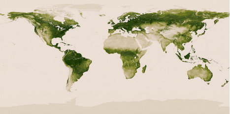

Thanks to the NASA/NOAA Suomi NPP satellite, NOAA has put together an incredible interactive map of the world's greenery, we can now see to an amazing degree of detail which parts of the planet is covered in green and which are bare. The map is thanks to the ability of the satellite to collect 2 TB of data every week -- and that's only the portion of data collected for the vegetation index.
Via Lauren Moss, Dr. Stefan Gruenwald


I'm hoping we'll see seasonal changes too! Great potential for looking at conservation issues, biodiversity, urban encroachment etc
It is a lot greener than you would think considering all the slash and burn hype the media puts out.